Thursday, October 29, 2015

Usability Lab Test - Aural Architecture

My co-student and I are working on a lab experiment that measures how well people can guess the size of a room from sound. We are interested in non-visual elements of design as well as the role that a lab experiment can play in architectural research.

Here is a little blurb from the draft of my essay. Because I think this whole idea is awesome and fun... For your enjoyment. :)


We have chosen to narrow in on sound as a non-visual element of architectural design. In "Spaces speak - Are you listening" Blesser describes the role of sound in spaces, and how architects tend to focus primarily on the visual to communicate their artistic, humanistic, cultural and expressive ideas. He presents sound as an element in the poetic design of spaces that has untapped potential to contribute to spatial experiences of any building. Rather than relegating acoustic architecture to theaters and music halls, or sound attenuation between residences, Blesser sees "aural architecture" as relevant in any typology.

In his book Blesser describes the ability to "see" architecture with our ears. This idea was a part of Vanderveer's study, where "echolocation" was explored as a means of navigating without the use of eyes (Griffin 1958). This might be normal for bats, but humans have similar abilities. With practice, and focus, a human can hear the amount time it takes for a sound to bounce off a wall to determine how far away it is. We can understand what the wall is made of through slight variations in frequency and we know the size of the wall by variations in loudness (Blesser, Salter, and Blauert 2007). Even though we rarely use this ability, it is an inherent, subtle way that we experience space. Imagine if architects could use this knowledge to create spaces that enhance, elevate and stimulate our auditory experience in any environment. It really is a lovely thing to consider.


Blesser, Barry, Linda-Ruth Salter, and Jens Blauert. 2007. “Spaces Speak, Are You Listening? Experiencing Aural Architecture.” The Journal of the Acoustical Society of America.

Griffin, Donald R. 1958. Listening in the Dark: The Acoustic Orientation of Bats and Men. Current Contents. Vol. New Haven.

Wednesday, October 21, 2015

More graphics. so fun. Cognitive Walkthroughs explained

I did this graphic as a basis to talk with my supervisors about how I intend to go about my research. I am not sure I can cover all of these areas, but at this point it seems the most logical approach. 

Basically I propose to start with a literature review to see previous work that has been done in this area. Then I will conduct a survey or interviews of architects to get a sense of the need for this work, and the best way I can help. Then I will conduct small lab experiments where I test out some of the User-Centered design methods I have identified. After these tests I will make a connection with one or two architecture offices that I can collaborate with and custom implement some of the methods. After the research I will do another survey or interview to see if the new methods are helpful.


Click on the above image for a pretty sweet little slide show on how to do a "cognitive walkthrough" (if I do say so myself)...This graphic may not be clear on its own, but once its explained in the slideshow I think it will all make sense.

The cognitive walkthrough is a usability test that you can do without having to bring in outside participants to test it on. It is a good way for the design team to state their assumptions about the users and test the design throughout the process.

Basically, the blue is the "Preparatory Stage" where you define your users, Try to explicitly state your assumptions about how they behave and their motives. You then think about what they would do with your design and outline specific tasks that they need to accomplish for them to reach their goal. An example in architecture might be:

1)User - 80 year old woman who likes to attend weekly bridge game
-What are her motives?
-What are her physical abilities/challenges?
-What will she want/need to do?

2)Tasks - What are the basic tasks she needs to accomplish?
-park her car
-find the front door
-walk to the front door
-hang up her coat
-find the bridge room
-find the tea and cookies
-find and use the washroom
-etc

The orange is the "Analysis Stage" where, the design team goes through the task list and figures out whether it is reasonable that the user can accomplish each task. You can ask these 4 basic questions:

1)Will the users try to achieve the right effect?
2)Will the user notice that the correct action is available?
3)Will the user associate the correct action with the effect trying to be achieved?
4)If the correct action is performed will the user see the progress is being made towards solution of the task

You can record the results on flipcharts or on tables. The information should give you a clear idea where users might have challenges and where further design should be done. It also gets the design team to think in terms of the end user early in the design process.

Friday, October 16, 2015

sexy new graphic. I made it all by myself.

I drew this:

This graphic shows the design process, and how it should be centered around the end users. I am interested in the blue parts - the fun little methods you can use to make sure the users are considered all the way through. I loved drawing this. I think all my papers are going to include illustrations. :)

I went to a great lecture this week. Totally unrelated to my research, but so great. David Gissen, a text-based artist. He showed three projects where he took an original "text" and recreated it through the fuzzy lens of environment. Sounds weird? One project he showed is where he took an old transcription of the bible, that would have been read before there was electricity. Through some sort of analysis there is a way to figure out which letters are miss-read as other letters, when seen under flickering candlelight. He then wrote an algorithm that re-wrote the main text with these miss-read letters. When you read the resulting text it at first looks like gibberish, but after a while your eyes adjust and it is very much like reading under candle light. I really like that project.

Anyways, another awesome discovery this past week has been how I can use Evernote and Mendeley combined for research projects. This has me so excited.

This is my sickly sweet process for you nerds:


I first look up a topic on Mendely that I am researching, and use google scholar and the university library to locate PDF's of relevant papers. I then save the papers on my computer, and create a "notebook" in Evernote specifically on the topic. In Evernote I create a separate note for each PDF and link them up.. 


Evernote (the premium version) has a great "annotate a PDF" function where I can highlight the heck out of papers, with little arrows or notes to show important info. Then Evernote gives me a sweet summary of the highlighted bits, so I can go back and easily go over multiple papers and remember what I read.


I then use that final note-book list to generate a sweet little bibliography and citations in Mendeley. This has made my whole life as a researcher one thousand times better. I am not printing out hundreds of papers and I feel I am actually reading and referencing appropriate content so much faster. :)

Of course they can improve, but this is such a huge leap forward...

"Gee, thanks Human-Computer Interaction theory for helping software designers develop amazing tools that actually really help me and are intuitive to learn." :)


Links

David Gissen
http://davidgissen.org/

Evernote
https://evernote.com/

Mendeley
https://www.mendeley.com/


Friday, October 9, 2015

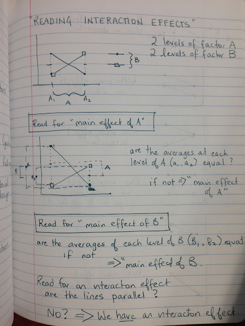
My teachers will be so proud. I said "Analytic Statistics" on YouTube.


Analytic Statistics.


One on my new growing passions is learning about how researchers:

take DATA and turn it into KNOWLEDGE


(I actually really like the way my notes look when I include, charts, diagrams and equations. I feel nerdy. And they look awesome. My note book has been pre-blessed by my kids, so I am often taking notes around their cute little drawings. I love that.)

Data can be words people spoke in an interview, measurements you took in an experiment, or the amount of steps it took for you to make a peanut butter sandwich. Data has existed, and an attempt has been made to measure it.


Knowledge? Knowledge is spiritual. It is the stuff of human evolution and it is the purpose of existence. We know, therefore we exist. We scrape and search for data because the screaming, pulsing, driving impulse to KNOW is hard wired into the very cells and spirits of our beings.

And one funny, silly little way we have to satiate this yearning is to MEASURE, and to DOCUMENT. And so we test, and experiment, and write down numbers, and then hope that this will let us..oh please will it...let us KNOW a little bit more about something.
Statistical Analysis is sobering. 
(It lets us know just how little we actually do KNOW about things through DATA.)

But then, a little sobriety doesn't hurt.

  • Statistical Inference. Is it likely that two data sets are the same? How likely are you to get similar results in future tests? How much variance is there? Error deviation? What is the normal Distribution?
  • The standard error of the mean is dependent on the sample size. How can you figure out where variance comes from - is it due to odd-ball participants or due to the condition that you are testing?
  • How can you analyze variance? ANOVA test? What if you are testing tow things that interact and you want to test the "interaction effect?" What if your data is non-parametric? 
  • What is the Mann-Whitney-Wilcoxon - Utest?

Thursday, October 1, 2015

MY FIRST COMPUTER PROGRAM EVER!!!

I made a Jellyfish!!! MY FIRST COMPUTER PROGRAM EVER!!!


And here is a little bit of the code I wrote to make it! (I have to put this up, because that the part I am most proud of!!) I am handing this project in today, but there is a lot more I was trying to do, but didn't figure out yet. I wanted to add Sin() waves to the bottom of the jellyfish, and import some images, I also wanted to see if I could import this one jellyfish into a larger background and have a hole bunch of them in a scene. There is so much more on top of that if I animated it using the void draw() function. I would love to have it sort of pulsing and fading in and out, maybe the tendrils moving around...all still to figure out.


Like most people I find videos easiest to learn from, and there a lot of videos online for processing. If I was going to just teach this to myself for fun I would fist do this tutorial : http://hello.processing.org/ (of course after downloading processing software from processing.org)

Then I would just go one by one through all these really fun tutorials. http://funprogramming.org/

I'd watch a couple then play around, watch a couple, then play some more. Its amazing how quickly you (or your kids!) will be able to create something very cool.

I am excited by the possibilities for this. I think there are so many ways interactivity and this sort of simple visual programming could help in architecture - and in user participation. 

In a similar note I had a good talk with a friend/local architect - Philip Vandermey SPECTACLE Bureau for Architecture and Urbanism Inc. He was able to share a bit about his experienced in Europe and some of the great evidence-based design work happening in the Netherlands. I am super-keen to learn more about these projects because they incorporate new technologies, architecture and participatory design...sweet!!

Here is their website
www.spectacle-bureau.com

Here is one project I am keen to learn more about.